Small Data Can Still Be Pretty Cool
Sure it’s nice to be able to take data sets of 1000 variables and 100,000 observations and do meaningful calculations, but that doesn’t mean finding interesting information is solely the domain of complex algorithms.
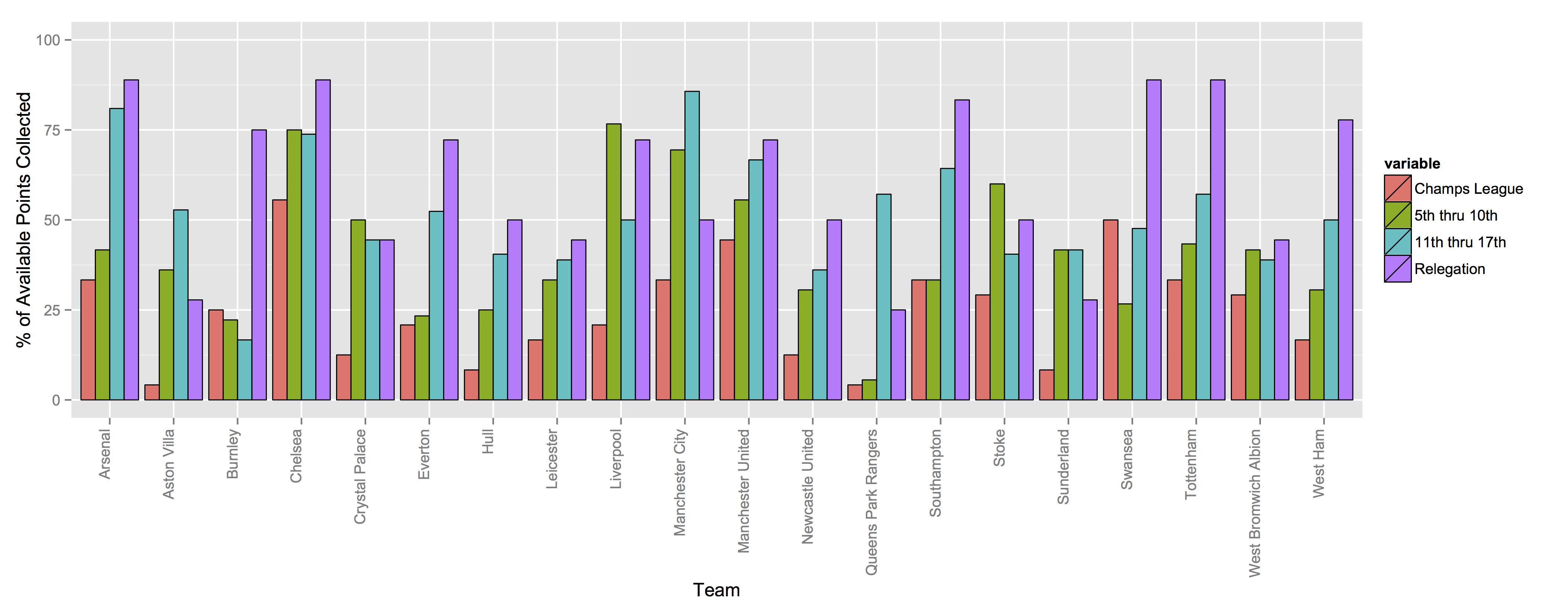
These are plots that are generated from nothing more than the season’s worth of league results (minus one week and one game) in England. Okay, from that we also needed table position, but the latter comes out of the former. Anyway the above graph is simply where a team picked up its points (you should be able to click on it to get a larger version). It’s almost like visualized regret.
All of the graphs here are the same info, just arranged in slightly different ways. That’s each team and what percentage of the available points they picked up against different parts of the table. So start on the far left with Arsenal, and start with the far left reddish-colored bar. That’s the percentage of total available points that Arsenal picked up against the other Champions League teams this season (it was 6 earned of 18 total, so that’s 33%).
We used percentage because the total points would actually punish Arsenal (and Chelsea and City and United) relative to the rest of the league (don’t worry, Arsenal punished themselves enough for sucking against the other CL teams). Arsenal can’t play itself (although if they did, they’d blow a 2-goal lead after the 76th and settle for a draw, hey-o!), so there are only 18 points available to them—6 each against Chelsea, City and United. Whereas, say, Villa next to them, they play all four teams that made the CL, so they can potentially accumulate 24 points.
Villa picked up 1 of 24. Oof.
The remaining three groups break down as the Also Rans (table positions 5-10), the Table Fodder (positions 11-17) and those getting Relegated (18-20).
For most teams the purple bar (how they did against the relegation teams) is really tall because it’s easy to pick up points from bad teams. It’s apparently really hard to do the double over the three worst teams in the league, though, as nobody managed it. That’s a little surprising if only because QPR were terrible for much of the year, so that was like a gimme for a good team. Conversely though, just looking at teams with a small purple bar reads like a who’s who of the teams that flirted with going down this season (obviously, that’s still not settled; so I’ll update after the final weekend’s games).
Back to Arsenal, relative to their ‘peers’ they did really poorly against the rest of the top half of the table. AFC’s green bar is pretty short compared to Chelsea, City and even Liverpool. Going 1-1-4 against Spurs, Southampton and Swansea will do that.
To simplify that 4-term graph (it’s a little visually dense), I made a second one of the same info lumped by top half/bottom half of the table. It’s here 1. It highlights AFC’s struggle with good teams even more. Heck, they did worse than Stoke against the top half of the table. Yet nobody did better against the bottom half of the league. That’s not going to help some players’ reputations for being flat track Muntz.
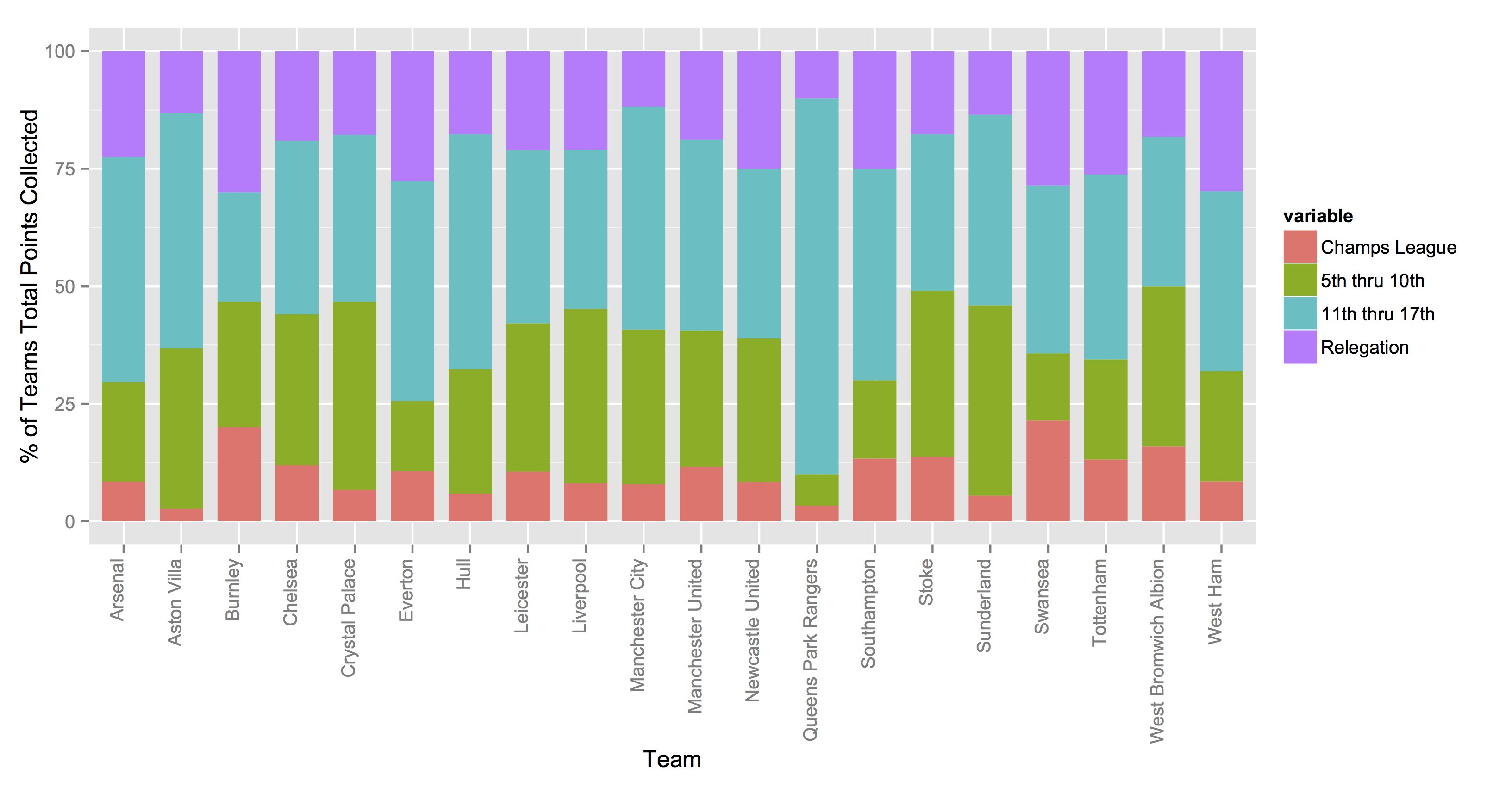
This second graph here is similar to the one up top, but it’s what percentage of a team’s total points came against each of the same divisions of the table. So Chelsea is sitting on 84 points; 11.90% of those came against the other CL teams, 32.14% against the Also Rans, 36.91% against the Table Fodder and the remaining 19.05 against the teams going down (all teams top out at 100% accordingly)2.
As with the top graph, we’ve got a problem of sorts in that the groups aren’t of equal size (4, 6, 7, and 3 teams respectively). Moreover, we’ve probably got a bit of a misleading graph in that, Burnley, next to Chelsea appear like they’ve done ‘better’ than Chelsea against the other Champions League teams. Burnley only pulled five total points off the CL teams (compared to 14 for CFC) but they only managed 30 points total, so their percentage of CL points looks deceptively impressive. Well, in the abstract, a really bad team taking five points from the two Manchester teams combined is impressive. It just shouldn’t look more impressive than the league champions3.
1 Another problem with that graph is that our sub-groups aren’t of uniform size. That’s partially because the ‘important’ dividing lines on the table aren’t in equal-sized groups. Four teams go to the CL (at least for now) and only three get relegated. If you want to see what this looks like with equal-sized divisions (1st-5th, 6th-10th, etc.), that graph is here.
2 For anyone who wants it, a csv with the raw data is here. This is after running a function that turned the scores into a table and the table into percentages. The column names probably aren’t totally obvious. I really did use the terms ‘alsoRans’ and ‘tableFodder’ in my functions. The numbers in those columns are the total points picked up against the teams in those categories. The adjacent columns should be read (for example with regard to ‘Table Fodder’) as “Percent Available (against) Table Fodder.” So that’s abbreviated pct (for ‘Percent’), A (for ‘Available’), dot, tf (for ‘Table Fodder’). Smush it all together and it’s ‘pctA.tf’ The other terms are cl for Champions League, ar for Also Rans, rel for Relegation, th for Top Half and bh for Bottom Half. The last six columns are for totals. So, for example, ‘pctT.cl’ is the points they picked up against CL teams divided by the total points they accumulated over the season.
3 I admit to being incredibly average when it comes to making good info-graphics. That’s still the case even having read Tufte’s book. There is probably a much better (elegant) way to display all of this.