Good Modeling Is Better Than Less Good Modeling
Why does having a good model matter? Well one reason is that so we don’t waste time.
There’s a piece over at “Saturdays On the Couch” about Borussia Monchengladbach and the sizable outperformance of their expected goals (ExpG) total for the 12-13 and 13-14 seasons in the Bundesliga. Overall it’s a really good read. Seriously, it’s worth your time because it’s a solid example of finding something that’s well outside of what we might predict, then trying to find an explanation for why that’s the case.
Still one of the replies from the author in answering a commenter question raised a flag:
“…teams are much more accurate in the Bundesliga. [M]y expG model covers all of Europe and Bundesliga teams convert at much better rates than the average European team, so essentially every Bundesliga team ‘outperforms’ my expG.”
Visually that looks like this (this is his chart, used with permission):
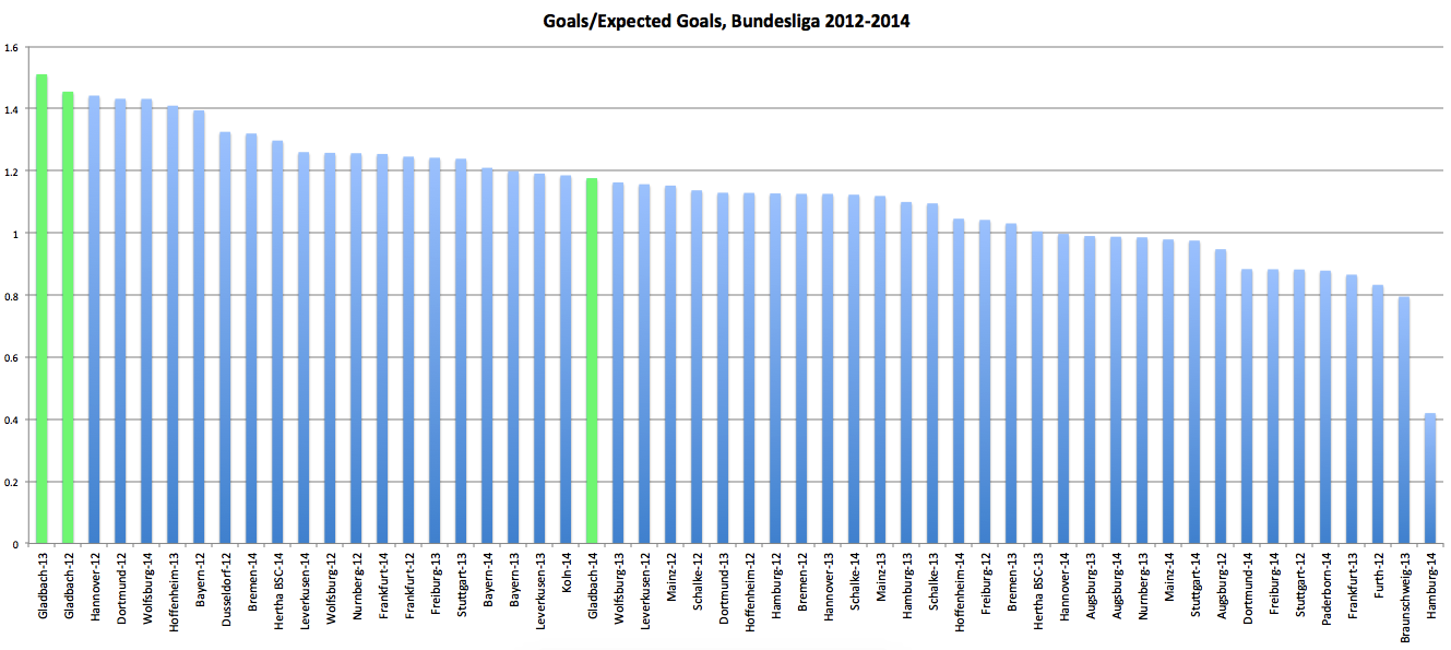
That’s the actual goals divided by the expected goals for all the teams in the Bundesliga from the last three seasons. Instead of seeing a big chunk of the teams in the middle of the graph right around 1 +/- 10% (roughly what we’d ‘expect’ 1), it looks like the bulk of the middle of the graph is actually around 1.1 +/- 10%. That’s a consequence of being more ‘efficient.’
That’s pretty similar to something from a Statsbomb piece that was one of the first things done on ExpG. Their piece has a couple of related plots, one of which is for how much better each league does than its ExpG. Germany has the highest above average efficiency. It’s accompanied by the comment: “Not the first time the words ‘Germany’ and ‘efficiency’ appear in the same sentence, I guess!”
So, why not model that? Sure it’s fun when math reinforces our stereotypes. Germans are more efficient in scoring goals because Germans are ruthless engineers of everything; the Eredivisie is free scoring because the Dutch have legalized prostitution, etc. But it’s better to be accurate, no?
Yes.
Anyway, shots do indeed go in at different rates in different leagues. Even if your model includes all of Europe, you should be able to add a factor for each league pretty easily.
And it turns out that, all things being equal, the odds a shot goes in simply because it was taken in Germany go up by between 8% and 14% 2. This isn’t an arbitrary fudge factor. We put a variable for each league in the model and we get a coefficient on it that accounts for how much easier/harder it is to score in each league.
After we account for different league effects, the graph above now looks like this:
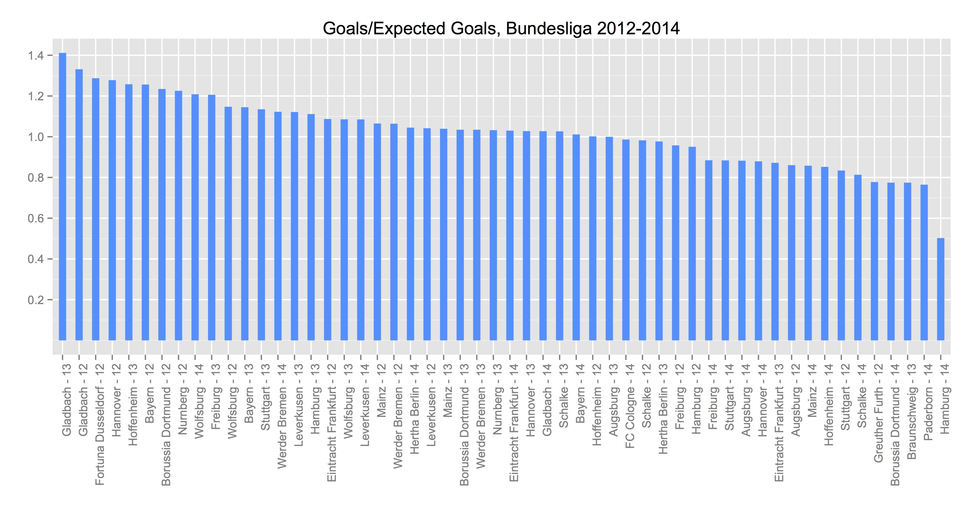
I tried to make it match as much as possible to make quick visual comparisons easy. I’m not sure how good of a job I did. But scan across the horizontal line at 1 for both graphs. Up top we had about 13 of the 54 team seasons between 1 -/+ .1, or about 24%3.
Now we’ve got 23 of the 54 teams in that range, or almost 43%4.
We don’t have the actual numbers from the above, so we can’t do a mean and variance calculation to see how much better we’re doing over the whole range of prediction but many of the teams we’ve ascribed ‘efficiency’ to have come down to something close to their ExpG calculation. Moreover, the pitiful Hamburg 2014-15 (dead last in both charts, and by some margin) has actually come up from something near .4 to almost .5. So we’re almost certainly doing better.
And Gladbach still have the two largest over-performances and probably still warrant a closer look.
Now, that has its own caveat. If you notice most of the top over-performing team seasons are from 2012: six of my top eight and five of the top eight from the “Saturdays on the Couch” piece. And that accounts for almost all of the teams doing more than 20% better than their respective ExpG calculation. So maybe it’d be better to first look at something that might have been happening league-wide that season, especially because it wasn’t even the free-scoringest season of the three plotted out here. There were 872 total goals in the league 12-13. That’s almost 100 fewer than in 13-14 when there were 967 goals (the season that just concluded totaled only 843).
Maybe there were four or five crap goalies in 2012-13 or perhaps the weather was perfect most of the season. Or the opposite. Maybe it was a record year for rain in Germany and defenders were constantly slipping, giving strikers target practice. I have no idea. Just theorizing possibilities. On the flip side, six of the bottom 10 are from this past season (six of 11 from “Saturdays”). So season effects might be very real.
Accounting for season effects in the model doesn’t explain what those effects actually are. That’s still something we’d like to know. And ultimately we’re not looking for reasons to explain over-performance away but if Gladbach really is doing something that breaks the model (or they are playing the game in a way that their shots have a higher probability of going in relative to the rest of the league) then it’s probably a good idea to have a good idea that they are actually an outlier5. Otherwise we’d waste a whole lot of time trying to find causes for phantom effects.
1 The 10% upper and lower bound is pretty much arbitrary. I’ve written elsewhere about the problems with ExpG models and, given how much left over deviance there is from even good models, plus/minus 10% seems like a reasonable range for being “close”. But yeah, it’s not based on any math.
2 The actual range is from about 8% to 14% depending on which criteria for model selection we use. A 1-standard-error selection is pretty conservative and gives us the low end 8%. AICc yields the high end 14%. We actually used a model with minimum deviance that puts it at about 9.8%. We picked it not because it was a happy medium, but because for all of the factors (and there are about 15 total), that model gave us the highest out-of-sample R-squared.
3 I actually brought the image into Photoshop and measured the pixel distance (to the tenth of a pixel) trying to find the precise midpoint between the line at 1 and 1.2. There was bar that was pretty much right on the line. Without the actual numbers, it’s really hard to tell if it’s greater than the 1.1 cutoff. So erring on the side of generosity we included it (i.e. it’s 13 of 54 instead of 12 of 54).
4 Let me be clear, I have no idea what all factors are in the ‘Saturdays’ model. And I’m making (what I think is) a pretty reasonable inference that there is no accounting for individual countries in that model. If there were then Germany would be less graphically ‘efficient’ (and the quote from the comment wouldn’t make any sense). Moreover, adding a factor variable for the country isn’t the only difference between the two models (again I have no idea what’s in that model).
5 Still on board with it. Mostly. I’d actually want to go back and add season effect variables to figure out how much of 2012’s overperformance might have been just Gladbach versus how much it was part of the rising tide that looks to have lifted several Bundesliga boats that season. If much of it is the latter, then suddenly we’re looking at one season where Gladbach is dead on their number (14-15… I didn’t highlight the Gladbach seasons but this one is almost exactly Actual/Exp = 1), one season where they maybe mildly over-performed (12-13) and one spectacular season (13-14). I will add this is just looking at the offensive side of the ledger. “Saturdays” looked at both the offensive and defensive ends combined when singling out Gladbach for their overperformance. Again, I really liked the “Saturdays” piece, but with better modeling we might find that, offensively, Gladbach isn’t doing anything revolutionary.
4 comments to “Good Modeling Is Better Than Less Good Modeling”
thanks for kind words on the Gladbach piece. as far as simply adding in a coefficient for each league, yes we certainly can do that to improve the model but I think it is a good project to find out exactly why there are such differences. I’m looking at team defensive and offensive styles right now at StatsBomb and know German teams try lots more long passes in the final third and as a whole press in the 60th percentile compared to England’s 35th for example. I think they convert due to more clean chances where there are no defenders in the way or around them, but want to find out why that is. I don’t want to simply change the model based on what league the team plays in if I don’t know why they are converting at such a higher rate.
They aren’t mutually exclusive, though. You can make your model more accurate by adding factor variables for the various leagues, but the coefficients on those variables will still tell you something. Even after adding variables for each league*, I still know the odds a shot goes in because it was taken in Germany go up ~8-14%. And of course you’ll still want to know why that is—in fact much of the good information you get out of model building isn’t necessarily with the output but with the coefficients themselves—but there is no reason to live with erroneous calculations for ExpG.
Basically we can have both: a better model, and information that tells us there is something different between the rates of scoring across leagues that probably needs explanation.
(* And I should clarify that it’s actually ‘league’ and not just ‘country’. If you put both the Championship and the EPL into the model you should find they have different coefficients. So just having “England” would conflate the two and actually be less accurate).
Any chance the difference is because of a difference in what is called a “shot” between the leagues/teams? In my head this is like the relative confusion over what exactly constitutes an assist in basketball. It’s down to the home scorer to decide (much like H/E in baseball), leading to marked differences in assist numbers between venues as well as between home and away.
Hadn’t thought of that. But now that I have, it’s pretty close to zero chance.